
| Fini |
 |
 |
|
| Why does it take so long to publish an article on the Louisiana Wrestling News |
| December 6th, 2013 | Written by: Editor |
First, let me preface this with the fact that nobody has complained about articles taking too long to publish. Many have asked when they will be published, but again, I have received no complaints. But the loyal readership deserves to know why this Website does not add new information, aside from some dual meet results which take very little time to furnish (the Archives results take a bit longer as they include copying and pasting the TrackWrestling tables).
First, it all starts with this garbled mess, a CT scan of the editor's brain depicting events, people, media and activities that have affected the editor in his two score and ten years so far.
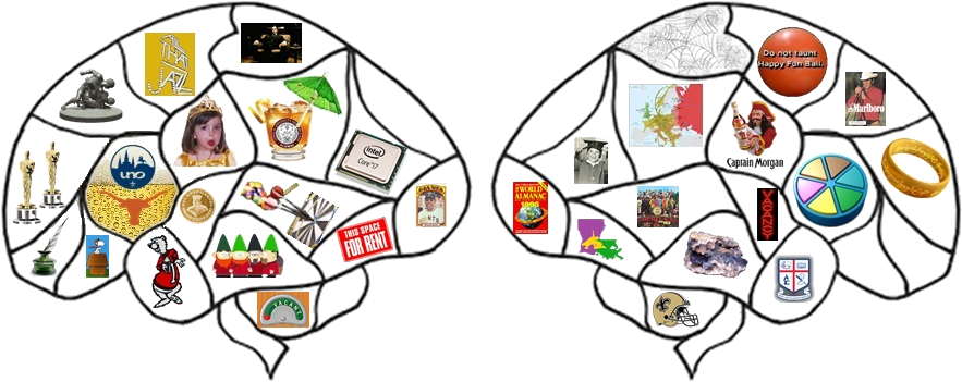
Some of you have probably seen me taking photographs at tournaments and duals meets. I tend to take way too many, a problem I first noticed last year when, at the Culotta and then the Sam Sara, I learned that if one keeps the button pushed on the camera, it just keeps on snapping. To my chagrin I found myself with 2,500 images when I got home. But wrestlers rarely let me know beforehand when they are about to do something exciting, so I have to try anticipate set-ups and the like. That leads to a lot of photos that depict nothing worth noting to any degree. I consider myself very fortunate to get focused photos of ankle-picks, for example. Cradle shots, on the other hand, are easy to get.
[NOTE - all images on this Webpage open to larger images in new windows when clicked.]
Hence, when I get home and save the photographs to my computer, and then open that folder, I get something like this:
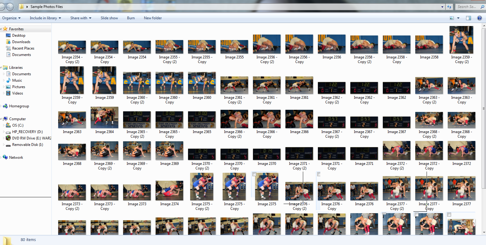 |
| It is a little hard to tell what is happening in those icons, so I hit "View" and "Extra large icons" and get this: |
 |
| It is much easier to work with these. |
The next facet is determining who is in the files and sorting them accordingly into new folders labeled "106 Finals" and the like. Then I have to rename and number, preferably in chronological order, each photo in the folder:
When that is done I hopefully have a folder for each weight class, and, if needed, separate folders for the semifinals, consolation rounds, finals, etc.
Then I get rid of the photos I do not like: the blurry ones, the crotch and butt shots, the ones showing nothing of particular relevance. As mentioned previously, cradle shots are easy and thus other media venues are replete with them.
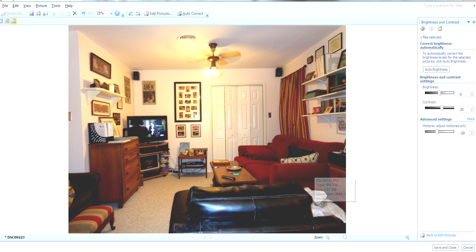
The next step is to edit the photo so it looks, to my untrained eye at least, better than it actually is. This generally involves changing the contrast and brightness a little, cropping the photo, and resizing it:
 |
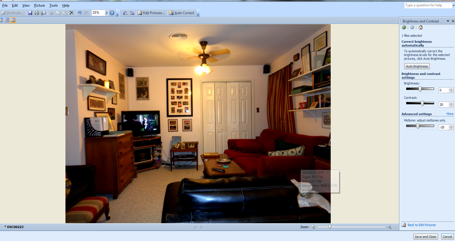 |
| Original image. | More contrast and less brightness (contrast is more important when displayed on a monitor). |
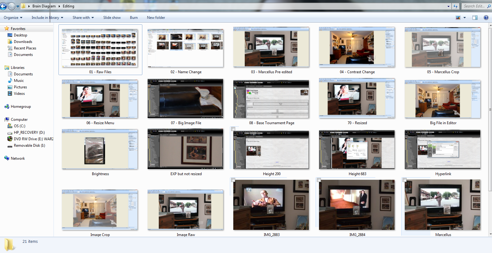
One needs to realize also that the original files are very big. When placed in the MS Expression, the Website editor I use, an original image will look like this:
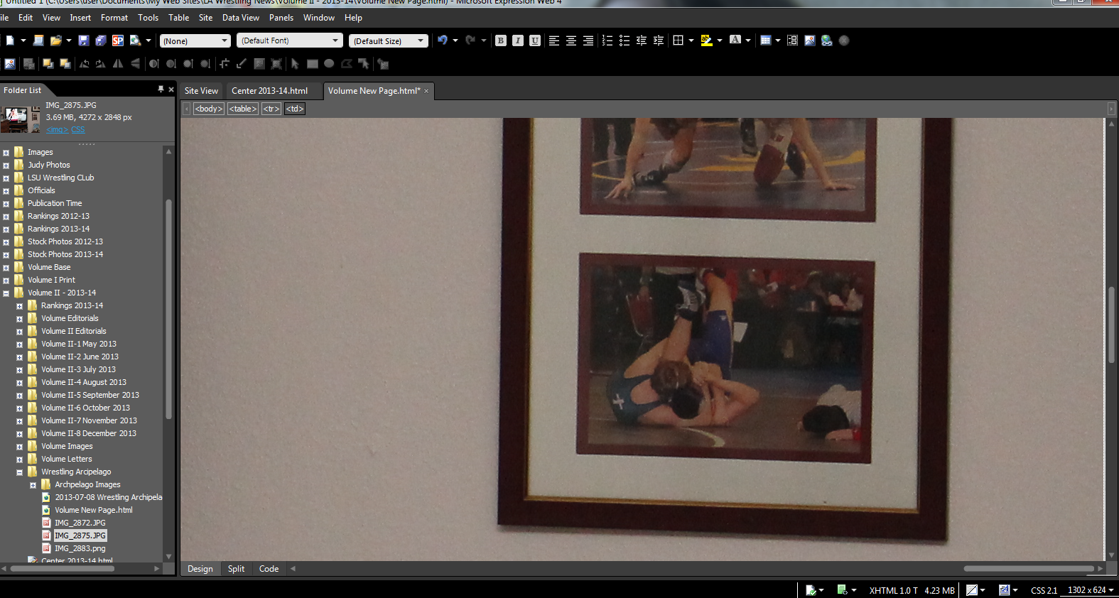 |
| When resized, an image that takes up much less space and thus loads much faster. |
The main reason to initially snap larger image sizes it that if a photo needs to be cropped, the resolution of the photo remains high (it has many more pixels). For example:
(Re the above example, most cropped images are larger than the DVD case so much more resolution remains in the image.)
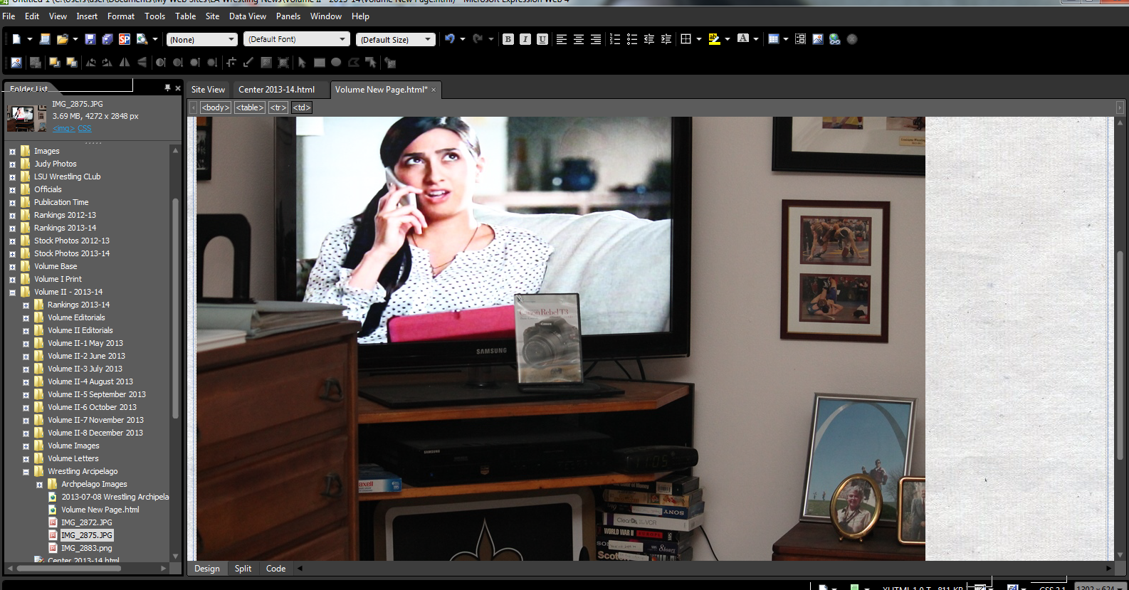
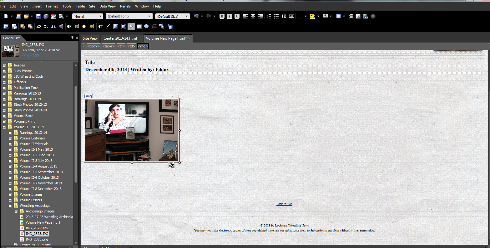
Even when cropped the images take up a lot of monitor space. Hence, I resize the images in MS Expression, and hyperlink them to the original image, meaning if the small image is clicked a full-sized image will open (if I set it to do so) in a new window:
 |
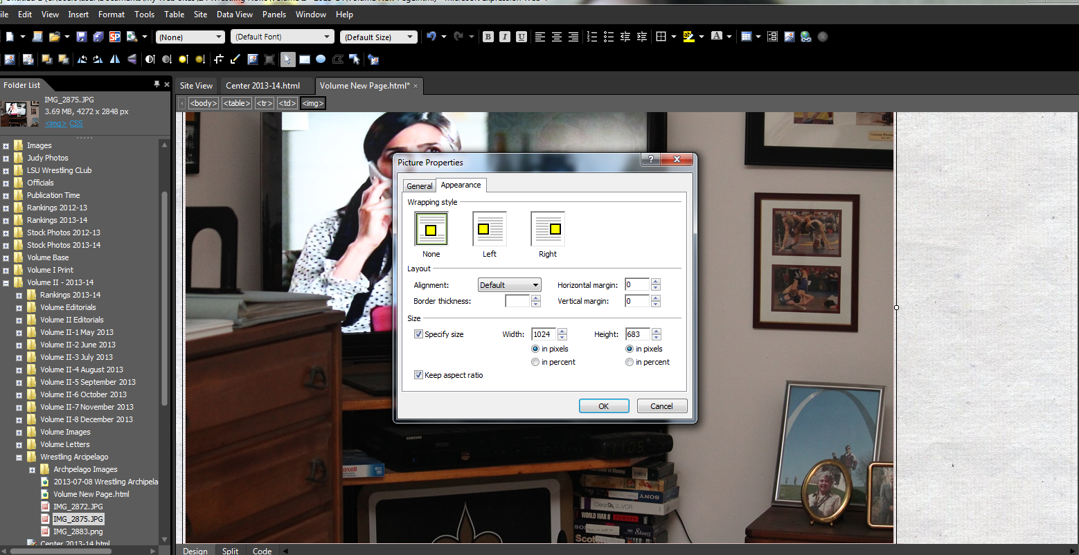 |
| The resized image from the photo editor. | The original image is 683 pixels high image in MS Expression. |
 |
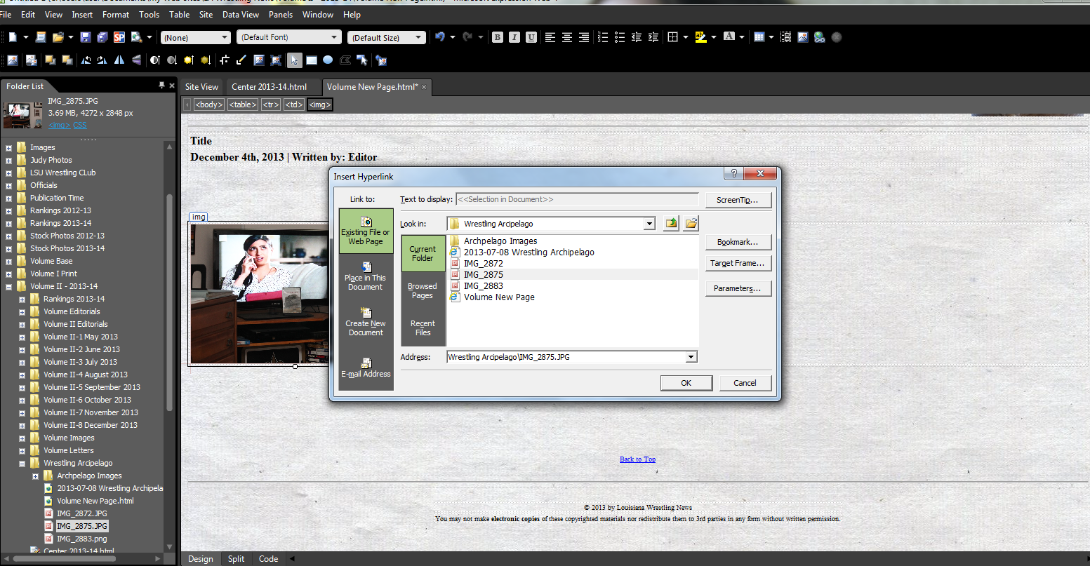 |
| The resized image on the Webpage is 200 pixels high. | Adding the hyperlink. |
You might notice that each cell and table is outlined in black. Tables highlight the separation of photos from each other and from text. But tables do not come like that initially. When first inserted, they look like this:
OK - well, that does not explain it to the viewer very well. Try the table
below:
| Photo 1 | Photo 2 | Photo 3 |
| Caption | Caption | Caption |
The above table, of course, has been modified. The outlines make it much easier to know where to place photographs. At times, for reasons I do not yet understand, they do not like to center themselves, but I have hopefully solved that with some "boilerplate" Webpages that I use:
So there it is. Multiply the process described above for each photo I like to publish in an article, and that is why it takes so long. Well, then there is the actual writing, and the research required to make the writing accurate. But those parts are pretty easy.
| At the end, usually as a reminder to myself or to let the viewer know I am finished... | ||||
|
||||
| (Nobody has prescribed my not remembering such times as yet.) |
Regardless, I am happy to put forth the effort. Videos can be useful, but they are so easily recorded these days that most of them sit idle and unwatched in a "cloud" somewhere. A good photograph takes as much or as little time as an individual wants to give it, and, well, it fits in a frame.

|
© 2013 by Louisiana Wrestling News |
|
You may not make electronic copies of these copyrighted materials nor redistribute them to 3rd parties in any form without written permission. |